Part of the the series: Doing Power BI the Right Way (link)
Data modeling 201-301 – continued from part 1
So far, you’ve seen that the essential components of a data model include tables related to each other. Filtering records in one table prorogates the filter to related tables(s), causing records in the related table to be filtered. This dimensional model schema is the foundation of the reporting solution. Once the fact and dimension tables are in-place, you can create more advanced solutions by working outside of this standard relationship pattern.
Using Disconnected Tables
Disconnected tables are useful in a variety of ways, allowing a user to select a value that drives the behavior of a dynamic measure, or by grouping values and performing some kind of dynamic calculation. Let’s focus on one of the disconnected tables shown in this figure, the Selected Measure Period table:

This table was created using the Enter Data feature and includes only one column named Period, which includes the following values:
Current
MTD
YTD
Same Per LY
PY
The exact text for these values isn’t really important because I have written specific DAX code to work with them.
The purpose of this post is to demonstrate effective data modeling and not DAX fundamentals but one cannot exist without the other. For our purposes, my model in this example contains five measures that calculate the Store Sales Qty with different time series variations. The Store Sales Qty measure simply returns the Sum of the Quantity field and the Store Sales Qty MTD calculates the month-to-date value for a given date. I’ve created another measure named Store Sales Qty Selected Period which is shown below. When a value in this table is selected, this measure returns the results of one of the other measures.

The following three images show cases where the Store Sales Qty Selected Period measure is used as the Value property of a matrix visual. Each row represents a date from the Order Date table. The slicer above the matrix allows users to select from one or more Period values from the Selected Measure Period table. By selecting only the value Current, the measure returns the Stores Sales Qty measure value. By selecting YTD the Store Sales Qty YTD measure value is returned.
The third example adds the Period field to the matrix Column group. For all values chosen in the slicer, a Period value is displayed in the column heading and the corresponding measure value is displayed in that column.


Here’s another example used to calculate the daily Orders Pending Delivery. The column chart below shows the daily number of orders where an order has been placed but not yet delivered. The dates on the X axis of the chart are from a disconnected table named Select Effective Date.
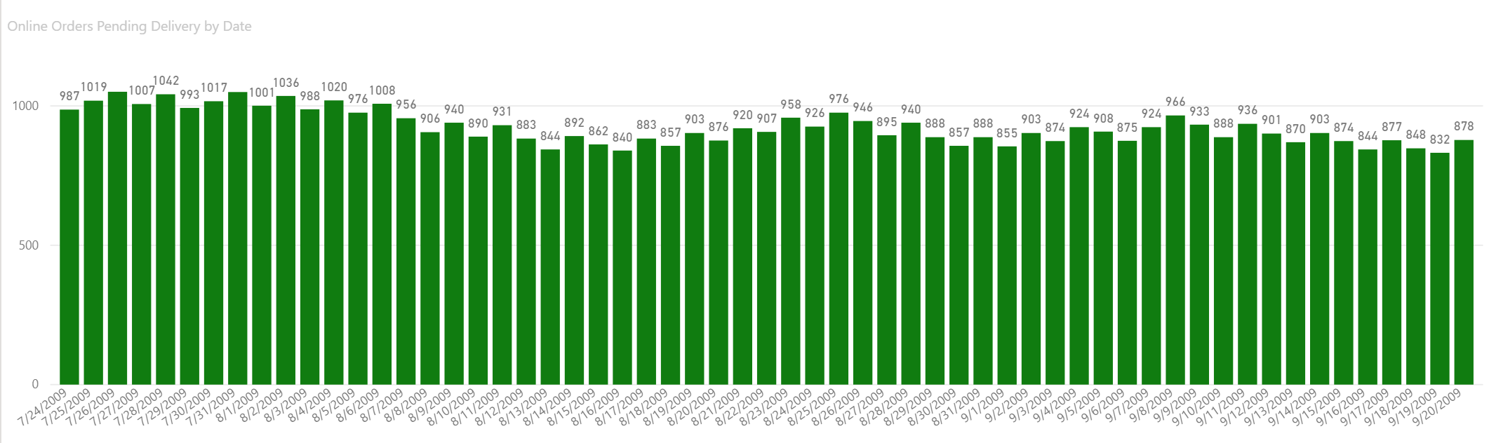
The logic for the Online Orders Pending Delivery measure depicted by each chart column is the number of orders where the Order Date is less then or equal to the selected date and the Delivery Date is greater than the selected date, or a delivery dat doesn’t yet exist. Here is the measure definition:

Once again, the disconnected table helps us work-around the normal constraints of related tables. The theme here is to use relationships to build the foundation and use them for primary reporting functionality. Then, use disconnected tables to take the solution to the next level with dynamic calculations and creative problem-solving.
The Answer to Life, the Universe and Everything: 42
Every data model should be designed to fulfill specific reporting requirements. This can be challenging when creating larger and more complex models. This isn’t to say that we can’t design utility models to answer a lot of different business questions but it can be difficult to create the utopian data model than can answer every question. In years past, I’ve seen attempts to create something like a “master cube” that contains nearly every table and field in the data warehouse, in an attempt to let users get insight about anything they could possibly imagine. There is a balance here, which you will see in the following section.
Relationships Don’t Always Work Out
The filter propagation from any one table in the data model to any other table can only use one set of relationships. The problem can be illustrated in the question: How do we determine the geographic location for Online Sales orders? Take a look at the following model diagram: Customers have a geographic location as evidenced by the GeographyKey in the Customer table, which is related to the Geography table using a column with the same name. Easy answer.

What about Store Sales? The Store table has a GeographyKey but there is currently no relationship from Geography to Store. That should be easy to resolve, right? Let’s just create a relationship from Geography to Store by dragging the GeographyKey column…

What the crap, Man! Why can’t we create the relationship? The warning message says “because this would create ambiguity between tables Geography and Online Sales”. Yep, sure enough, if that relationship were active, the data model would have two different paths between Geography and Online Sales and wouldn’t be able to decide whether to follow the filter through the Customer table or the Store table. This is a little bit like Google Maps selecting one of multiple routes between two locations. It might tell you that you can take an alternate route and add 15 minutes to your drive but you can only take one route or the other.
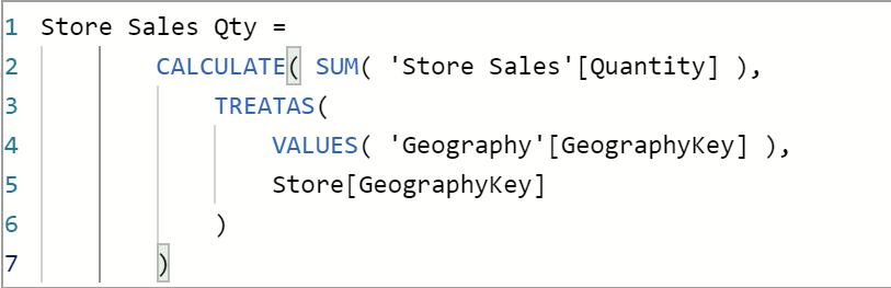
So, how do we deal with this problem? …through the magic of DAX, of course. We don’t need no stinking relationships! Rather than relying on natural filter propagation through a relationship that we can’t implement, we create a measure that implements a pseudo relationship using the DAX TREATAS function. Here, the Store Sales Qty measure is explicitly taking all the selected GeographyKey values in the Geography table and creating an in-memory table using the VALUES function. The TREATAS function is saying “take this table of values and treat it as if it were the GeographyKey in the Store table”, effectively filtering Store records using the selected Geography records.
The result is simply that Store Sales Qty can be grouped and filtered by any field in the Geography table.

I have a unique appreciation for the TREATAS function which was introduced late, after we began to embrace DAX in Power BI, SSAS Tabular and Power Pivot. I was in the Community Zone at the PASS Summit in Seattle some five years ago. Someone asked for help with a similar problem which was a challenging but interesting puzzle. Chris Webb happened to be passing by so I dragged him into the conversation. We spent well over an hour hammering out DAX code on a laptop before he presented a solution consisting of CROSSJOIN, FILTERTABLE and SUMMARIZE functions. I don’t remember all the details but it was complicated. Chris has avoided me ever since (I’m kidding… Chris is a super nice guy, enjoys a challenge and always willing to help).
The underpinnings of many DAX functions are a sea of internal logic and code meant to solve specific business problems. Spending time with experts like Chris, Marco Russo and Jeffery Wang (who architected the DAX language) have helped to to appreciate the immense power yet simplicity that this language offers.
Who Needs Relationships Anyway?
One more example. This one is just for fun and the point is to underscore that although a data model with properly-formed relationships is very important, this should not be the limiting factor in a project design. Take a quick look at the following Power BI report page. What do you see?

There are several report visuals that group the Online Sales Qty measure and time-series variations of this measure by different dimension attributes. You would expect there to be a rich data model with several related tables to support all this functionality, right?
Here is the diagram view of this data model. It contains only one relationship and even that could have been eliminated to further make the point.

How is this possible? Isn’t the whole point of a data model to make this type of data visualization and analysis possible? What’s going on here? The Online Sales Qty measure apply the same DAX code pattern that I showed you before, using the TREATAS function to build virtual relationships on the fly:

How does this measure perform compared with a conventional measure in a “proper” data model? With a few hundred thousand fact records, it performs just fine but in a more complex data model with a larger volume of data, this might not be the best approach. The primary reason that performance could degrade is that the measure code causes queries to use the tabular formula engine rather than the storage engine, which is typically faster. My point with this demonstration is that you can use similar techniques to do just about anything you can imagine.
Conclusion
Start with a well-crafted dimensional data model built using best practice design patterns and rules. Use exceptions when needed to address specific requirements – in the form of flattened tables and master-child relationships. Then you can graduate to using special cases like no relationships at all, to address specific use cases and reporting needs. Start with the basics, adhere to the rules and then make exceptions as needed.
As usual, I had a few more things in-mind to cover when I started this post that will be deferred to later posts, to be covered in greater depth. These include:
- The current state and future of Power BI data model design
- DirectQuery and Gen 1 composite models
- DirectQuery over Power BI datasets & SSAS models (Gen 2 composite models)
- Using External Tools for advanced data model design
- When and how to use calculation groups to standardize measure variations
Supporting Resources
Star Schemas
https://www.sqlbi.com/articles/the-importance-of-star-schemas-in-power-bi/https://docs.microsoft.com/en-us/power-bi/guidance/star-schema
Many to Many Relationships
https://docs.microsoft.com/en-us/power-bi/guidance/relationships-many-to-many
Model Optimization
https://docs.microsoft.com/en-us/power-bi/guidance/import-modeling-data-reduction
DirectQuery Guidance
https://docs.microsoft.com/en-us/power-bi/guidance/directquery-model-guidance


Thanks for your informative article – nice job!
At my company we created our version of a master cube using a variant of a “link table” model, meaning all relationships are pre-defined as sets of keys in a link table. In Power BI all tables are then just related to the link table. Sure, the size of the model becomes about twice that of a star schema model (due to cardinality in link table) but the link table design saves us from all the issues you normally get using a star schema (ambiguity etc). Our model has multiple facts and dimensions and a couple of millions of rows, and performs good on a Pro-license. So, what’s my point? I’m looking for someone to challenge our approach. Everywhere I read about star schemas being the holy grail for BI, but a see so many drawbacks with star schemas I’m surprised about its hype. But on the other hand no one writes anything about link table models (expect for Qlik), so I’m guessing there must be some major drawback I haven’t figured out yet 🙂
I agree with your take on using TreatAs when necessary. A good data model is the place to start but then when needed peppering in a few good DAX calcs can make all the difference.