Paginated Reports eBook Introduction, Resource and Sample Data Downloads
Edward Tufte, one of the pioneers of data visualization, presents the idea of sparklines. As Tufte describes it in his book Beautiful Evidence (Graphics Press, 2006), sparklines are “small, high-resolution graphics embedded in a context of words, numbers, and images.” These are simple, word-sized graphics that are an alternative to large, busy charts used to communicate a simple trend or series of measurements. In order to be meaningful, sometimes charts need to have annotated gridlines, point labels, and legends. However, some charts can effectively serve their purpose without the use of supporting text labels. To illustrate observations like “sales are improving,” “a product is profitable,” or that a trend is cyclical, a simple trend chart needs little or no labeling. Sparklines are best used when embedded in text or other report formats.
Recipe Ingredients
Product Versions (One of the following):
- SQL Server Reporting Services 2016 or newer
- Power BI Report Server
- Paginated Reports in Power BI or Power BI Desktop
What You’ll Need
- A query expression used to return trend data
- A small, simplified line or area chart item
- A table item to display master rows
Difficulty Level: 200
Contributed by Paul Turley
The modern concept of small multiples is embodied in the sparkline, small charts that are repeated within a group of data. The fundamental characteristics that distinguish a sparkline from a standard line or area chart are that the that A sparkline is .
Designing the Report
Column and line charts are best suited for this type of presentation. In the example, you’ll use a line chart to show sales trends data from the PaginatedReportData database. You’ll design a sales trend report that will contain sparkline charts for each product category broken down by year. The final result is shown in Figure 1.

Figure 1
Sales Trends
This example shows product category sales on each row and sales by year in an associated line chart, plotting sales totals by month. This report’s dataset is based on a query that returns aggregated reseller and Internet sales by year and month, and then by product category.
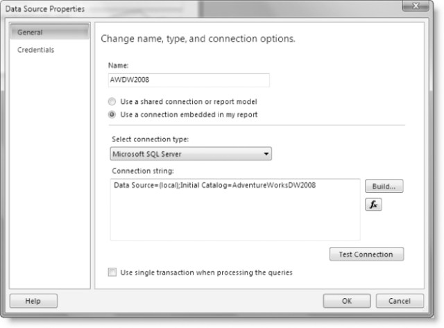
Let us begin by setting up your data source and dataset for the report. You’ll create a dataset with a connection to the PaginatedReportData database, as shown in Figure .
Next, you’ll add a new dataset and configure it to use the data source we set up in the last step. For this sample, you’ll use a query of type text and enter the following SQL in the query text box of the dataset:
SELECT
SUM([SalesAmount]) AS SalesAmount
, [ProductCategory]
, [Year]
, [MonthNumber]
FROM Sales s
INNER JOIN [dbo].[Product] p ON s.ProductKey = p.ProductKey
INNER JOIN [dbo].[Date] d ON s.OrderDate = d.TheDate
WHERE Year > 2010
GROUP BY
[ProductCategory]
, [Year]
, [MonthNumber]
;
This SQL query will give you the sum of both reseller and Internet sales amounts by year and category. It also provides data for the months so you can create the trend graph. This data should give you a good sampling for a trend analysis report.
Now, let’s create the data regions:
If you started from scratch with a blank report body, remove the data region placeholder from the report body, since you do not wish to use the wizards to add more datasets. You’ll manually add the table as follows.
From the Insert menu, select the table item and then the Insert table option. Click and drag the table element over the report body to create a table so you can place our data fields on it.
Delete the original Details row group and associated rows.
Now you need to create your own row groups with the following data fields in this order: (1) Calendar Year, and (2) English Product Category. To do that, simply drag each of the respective dataset fields onto the Row Groups window. Notice that when you drop the Category Name field in the row group window, it will become a child row group of Calendar Year.
You will display your tabular data in three columns, corresponding to the year, category, and sales aggregate values. By default, when you added the row groups, Report Builder also added respective columns to your table layout using the same table row. You may choose to keep this layout, or break the rows up into a header row for the parent group (year) and another row for the child row group (product category), shown in the following figures. The aesthetics are up to you, as you likely have a basic understanding of report layout design and customizations.
Finally, add one more column to the far right of the table, which will serve as the container for our trending lines later on. Add a header text to the column such as “Sales Trends.”
Now you need to create the chart that will provide the trending sparkline. The chart’s dataset should be the same used by the table, since you’ll nest the chart into the table. “Smooth Line” is used here, but the normal “Line” type will work as well. Also, if you would prefer to have a gradient look instead of simple lines, you can choose the “Area” or “Smooth Area” chart types.
The goal of the sparkline is to keep it simple and clean while showing relative sales trends instead of specific values and points. To achieve that goal, you must remove all “noise” from the chart by getting rid of borders, labels, gridlines, and so on. The only thing you’re interested in is the actual line graph.
If you are using one of the area chart types and want the gradient effect, then go to the Series properties, and change the fill type to Gradient. The final result of this recipe (see Figure 6), shows an example with the gradient fill and uses a lighter shade of blue and yellow for primary and secondary colors, respectively (although that’s not obvious, since the figure is in black and white).
Also, it may be visually more appealing to set the border of the series to a solid line and a contrasting color like blue (to match our theme). This will give the area gradient a nice contour line, defining the perimeter of the shape.
In Figure 2, you can see that the table and chart are added and set up in separate areas of the report body. You need to assign data fields to the chart, so follow the steps below.

Figure 2 – Sparkline Properties
Drag the field MonthNumber on the category region.
Drag the field ExtendedAmountSum on the data fields region, which automatically is aggregated in that region with the SUM() expression.
After the chart is configured, add it to the table by dragging and dropping it in the appropriate cell. Since the chart will be displayed for each given year and product category group, you will include it in a group header row instead of the detail row.
In a production reporting solution, you might create a separate chart report, similar to the sparkline chart but with more detail. Figure 3 shows this report in design view after placing the chart inside the table.

Figure 3
Finally, Figure 4 shows the finished report. The trend line shows sales totals over the course of the year. Whether data points represented days, weeks, or months, the effect would be the same.

Figure 4 – Preview
If you use the Smooth Area chart type with a gradient fill effect for the series, as previously mentioned in this recipe, the report will look like it does in Figure 4. As a final note, it is worthwhile to mention that for the SQL Server 2008 R2 release of Reporting Services (slated for 2010), the designer will introduce a few new report item controls, one of which will simplify the creation of sparkline reports (Figure 5 shows the new toolbox item). These new menu items will simplify the process for creating common visualizations by automating some of the steps introduced in this recipe; however, the approach and techniques remain the same.

Figure 5 – Data Visualizations
The new Sparkline report item will provide a simple drag-and-drop control and reduce the number of steps required for creating eye-catching sparkline reports.
Final Thoughts
In this recipe you saw the use of sparklines as a great way to represent trending data within your reports. You also walked through the steps to create your very own sparkline report using SQL Server 2008 Reporting Services.
The charting components in Reporting Services 2008 provide a rich design-time experience, full of configurable options that enable you to create charts to match your style preferences. In the upcoming 2008 R2 release of Reporting Services, we look forward to sparklines as first-class citizens of the report designer toolbox.
Credits and Related References
Beautiful Evidence, Edward Tufte (Graphics Press, 2006).
Professional SQL Server 2008 Reporting Services, Turley, et al. (Wrox, 2008).
Sean Boon’s blog: http://blogs.msdn.com/seanboon/archive/2008/10/10/how-to-build-sparkline-reports-in-sql-server-reporting-services.aspx.