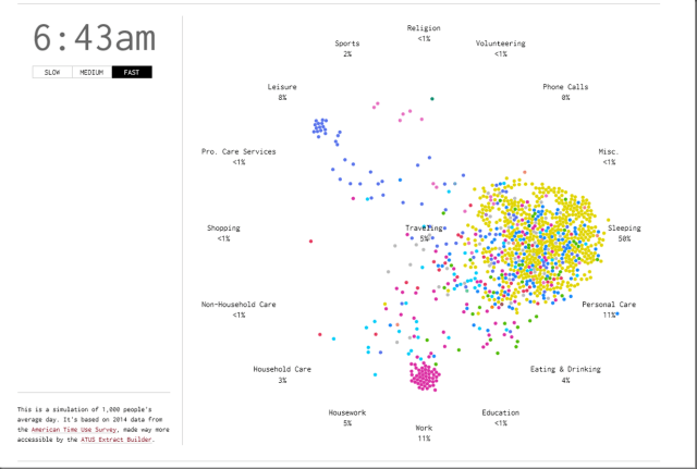
One of the more effective data visualizations I’ve seen in a while, this animated visual is a time-varying Markov chain developed by Nathan Yau of FlowingData. This is a simulation of 1,000 people’s average day. It’s based on 2014 data from the American Time Use Survey, made way more accessible by the ATUS Extract Builder.
Related Posts
Doing Power BI the Right Way: 9. Choosing the right report type: analytic or paginated
Writing this blog series while juggling other commitments has brought me to two realizations: 1. Posting articles in the series will be sporadic, and 2. The topics will be in fairly random order based on the projects I’m working on and the topics that are most top-of-mind at the time.
This brings me to the subject of this post: Paginated and Analytic reports.
Can’t We Just Get Along? Making SSRS, Power BI and Excel Play Well Together
Please join me and other 2017 PASS Summit speakers for 24 Hours of PASS: Summit Preview on July 19th and 20th. 24HOP is a series of 60 minute on-line sessions presented back-to-back for 24 hours, from the same professionals who will deliver preconference and main conference sessions during the Summit the first week of November this year. These online sessions are free of charge and normally attended by thousands of individuals to gain insight and knowledge about the topics. 24 Hours of PASS features free educational webinars delivered over 24 hours. Topics covered in this edition include Performance Tuning, SQL Server 2017, Linux, DevOps, Azure, PowerShell, SSRS, Power BI and much more. Browse all sessions. These webinars provide a sneak peek at some of the best practices, expert tips and demos you’ll find at this year’s PASS Summit in Seattle.
Power BI Hands-On Workshops in April, 2017
During the month of April, I will be delivering three full-day Power BI hands-On workshops. Each of these events will be the Friday preceding these SQL Saturday events. Seating is limited and many of these workshops tend to book-up. Follow the links to register.
Huntington Beach, Orange County, CA; March 31
SQL Saturday: April 1
Madison, WI; April 7
SQL Saturday: April 8
Redmond, WA; April 14
SQL Saturday: April 15
The format will be the same for each event. These are intermediate-level workshops. If you’re new to Power BI, just a little self-study should get you ready to optimize your learning experience.

One thought on “Animated Visual: A Day in the Life of Americans”