Charts and graphs are everywhere but how can you use the right visual to accurately display a measurement or effectively convey a message?
https://vine.co/v/eABFmretv5T/embed/simple
This page will serve as a collection of data visualization examples. Over the years, I’ve found many great (not to mention quite a few really bad) examples of data visualized in effective and interesting ways. There are many good examples throughout the web sphere of great visuals surrounding different communities of tools and interests. I’d like to showcase many of these examples here.
I ask that you contribute by suggesting examples, sites and resources. If you have questions or requests, please post comments here.
| Good Examples | Great Examples |
   |
|
| Bad Examples | |
Sparklines – Economic Recovery Trends
Aug 2014
This is one of the most useful and relevant visuals I’ve seen recently – from The Upshot/NY Times. Each sparkline represents a time-series of average salaries in a specific industry. As you roll-over each line, a pop-up displays a complete area chart with active call-outs and details, which shows the affects of the economic recession to the salaries in that industry. Lines are placed left to right to indicate low-to-high relative salary ranges and bottom-to-top to show how significantly different industries were affected by the recession.

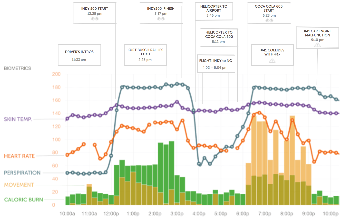
NASCAR driver Kurt Busch’s BASIS bio stats
July 2014
To start things out, I thought I’d share this visual from the folks to produce the Basis Band fitness tracker (recently acquired by Intel). They strapped a band on Kurt Busch, aka “The Outlaw”, and monitored vital biometric stats during “The Double”, two back-to-back races on May 25th. After monitoring nearly nine hours of sleep, Kurt raced the Indy 500 and then commuted by helicopter to Charlotte for the Coca-Cola 600. As you can see, it was a full day and quite a ride – several, actually.
Nice application of a stacked column chart combined with marker line time-series charts with six series values and grouped call-out markers.
Just a side note… I started wearing a Basis Band a little over a month ago and now have a bunch of my own kick-butt metrics like those below. Of course, I’m not a Nascar driver so they’re not nearly as impressive to the general public.
Kurt’s sleep patterns the night before race day
![Double-Sleep-Data-1024x597[1]](https://i0.wp.com/sqlserverbi.blog/wp-content/uploads/2014/07/doublesleepdata1024x59715.jpg?ssl=1 "Double-Sleep-Data-1024x597[1]")
i just purchased the book SQL Server 2016 Reporting Services and Mobile Reporting. In the introduction it mentions sample exercises available at wrox.com. I no longer see these available. Any way to keep them another way.
Thank you,
Karma Wyman
I am looking to create a flashing dot or circle on the Map based on zipcode. eg. I want to flash the dot for zipcodes that have zero sales.
The only method I am aware of with Power BI would be to create a custom visual, which would not be trivial. Maybe this can be done using the R visual?
Dear Paul,
https://vine.co/v/eABFmretv5T/embed/simple has some server issues, Just to let you know.
A question,
I have with me Survey conducted with 55 questions .. If I have to convert that into excel chart or Power BI, is that correct statement to map each of the response to quantifying number ? If so, what value should I assign for “Not Applicable”