

March 24 update – This post will be updated frequently for the next few days. Please watch for updates.
This is a Power BI report (<link) I have developed and published with public access to the web to be shared with anyone who needs access to this information. It contains daily updates from the Center for Disease Control (CDC) using data curated by the Johns Hopkins University Center for Systems Science & Engineering. To the best of our collective ability, the data is accurate but I cannot make any guarantees. Please validate with other sources before making any decisions with this information.
Additional enhancements and contributions are being made by Microsoft MVPs and community members:
- Jamey Johnston (@STATCowboy) contributed this report
- Gilbert Quevauvilliers (FourMoo) suggested Recovery Rates (added today) See an updated video tour here.
After the initial version, my colleague Robin Abramson spent late evenings and a weekend to help work-through design details. I appreciate members of the Microsoft MVP community, Reza Rad and Miguel Escobar, stepping in to help with query updates to get scheduled data refresh working.
I’m very hopeful that the this report will be a valuable resource. It’s been a labor of love and considerably more work that I envisioned. But, I will continue to work on enhancements and corrections as I am able – based on feedback. I started working on this project to help a consulting client try to understand how the virus outbreak is affecting their customer order shipment delays and materials supply chain. That grew into a off-the-clock side project, demanding nights and weekends to get this far. Now, I hope we can use this information to proactively respond to this threat.

Please post comments here or contact me through Twitter, if you have feedback, comments and questions.


The CDC and WHO began collecting COVID-19 case information from various sources on January 22 with the latest count of confirmed cases, recovered cases and deaths recorded by country, state or province. John Hopkins University collect this data every day and store files in a publicly accessible GitHub repository. On March 1st, they began geocoding the location for each case, where available, with the latitude and longitude. Location information is sparse but available frequently enough to observe trending.
Pete Gil at Pragmatic Works initially discovered this data source from another report published at worldometers.info. He scraped their web page and created an attractive Power BI report with the latest daily numbers. Springboarding from that project, I went back to the source files and created this new data model with daily snapshots and cumulative updates.
Watch for updates (where I’ll explore the design and more details) but this a quick tour of the initial set of report pages based on my published data model:
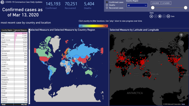
The first page provides some background information about data sources, credits and a report page menu:


Use the bookmark buttons to navigate to each page. You can also use the page number navigation buttons below the report.
The three measures displayed at the top of this and other pages show the latest counts, as of the highest select date range. Use the range slicer to limit the time-series charts and to set the “as of” date for the latest measures (Confirmed, Recovered and Deaths).
Right-click the line/area or stacked column charts to drill-through to details for a specific date.

The Global Cases page displays the aggregate case counts by country and for known locations. You can switch between the three measures using the radio button slicer. This changes every value on this page to use the selected measure.
On every page, you can narrow the view of countries using the Country Region drop-down list slicer. Use this slicer to deselect countries that have a high number so you can view and compare other countries. Hold Ctrl to select and deselect multiple items from the slicer item list.
The Country shape map definition was created by David Eversvelt. I’ve made some modifications to accommodate country names provided by the CDC.

I have created three separate pages with Country/State & Province maps. Only a limited number of shape map files are available in Power BI so I have selected the US, Canada and Australia for now.

Either use drillthrough or navigate to the Detail Matrix page. The matrix shows the progression of the selected measure over time within a region. Expand the geography hierarchy to view details by states or provinces for a country. The date range slicer in the top-right can be used to control the range of dates displayed as columns. Within the scope of the displayed data, the largest values are displayed with graduating shades of red.

To narrow the comparison, use the Country Region slicer to filter by country and change the scope of the conditionally colored cells. This allows you to remove irrelevant regions and focus on those of interest.

The Novel COVID-19 Coronavirus outbreak is a serious matter that is affecting our world in ways that we are only beginning to understand. If we can use this data to better understand what is happening , maybe we can use this information to mitigate the affects if this global event.
What questions do you need to answer and how do you need to use this information?
How can we look at it differently to provide better insight?
How do you need to correlate the the state of cases with other data to make decisions and forecast outcomes?