March 24 update – This post will be updated frequently for the next few days. Please watch for updates.
This is a Power BI report (<link) I have developed and published with public access to the web to be shared with anyone who needs access to this information. It contains daily updates from the Center for Disease Control (CDC) using data curated by the Johns Hopkins University Center for Systems Science & Engineering. To the best of our collective ability, the data is accurate but I cannot make any guarantees. Please validate with other sources before making any decisions with this information.
Additional enhancements and contributions are being made by Microsoft MVPs and community members:
- Jamey Johnston (@STATCowboy) contributed this report
- Gilbert Quevauvilliers (FourMoo) suggested Recovery Rates (added today) See an updated video tour here.
After the initial version, my colleague Robin Abramson spent late evenings and a weekend to help work-through design details. I appreciate members of the Microsoft MVP community, Reza Rad and Miguel Escobar, stepping in to help with query updates to get scheduled data refresh working.
I’m very hopeful that the this report will be a valuable resource. It’s been a labor of love and considerably more work that I envisioned. But, I will continue to work on enhancements and corrections as I am able – based on feedback. I started working on this project to help a consulting client try to understand how the virus outbreak is affecting their customer order shipment delays and materials supply chain. That grew into a off-the-clock side project, demanding nights and weekends to get this far. Now, I hope we can use this information to proactively respond to this threat.
Please post comments here or contact me through Twitter, if you have feedback, comments and questions.

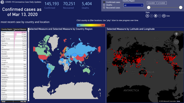
The CDC and WHO began collecting COVID-19 case information from various sources on January 22 with the latest count of confirmed cases, recovered cases and deaths recorded by country, state or province. John Hopkins University collect this data every day and store files in a publicly accessible GitHub repository. On March 1st, they began geocoding the location for each case, where available, with the latitude and longitude. Location information is sparse but available frequently enough to observe trending.
Pete Gil at Pragmatic Works initially discovered this data source from another report published at worldometers.info. He scraped their web page and created an attractive Power BI report with the latest daily numbers. Springboarding from that project, I went back to the source files and created this new data model with daily snapshots and cumulative updates.
Watch for updates (where I’ll explore the design and more details) but this a quick tour of the initial set of report pages based on my published data model:
The first page provides some background information about data sources, credits and a report page menu:

Use the bookmark buttons to navigate to each page. You can also use the page number navigation buttons below the report.
The three measures displayed at the top of this and other pages show the latest counts, as of the highest select date range. Use the range slicer to limit the time-series charts and to set the “as of” date for the latest measures (Confirmed, Recovered and Deaths).
Right-click the line/area or stacked column charts to drill-through to details for a specific date.

The Global Cases page displays the aggregate case counts by country and for known locations. You can switch between the three measures using the radio button slicer. This changes every value on this page to use the selected measure.
On every page, you can narrow the view of countries using the Country Region drop-down list slicer. Use this slicer to deselect countries that have a high number so you can view and compare other countries. Hold Ctrl to select and deselect multiple items from the slicer item list.
The Country shape map definition was created by David Eversvelt. I’ve made some modifications to accommodate country names provided by the CDC.
I have created three separate pages with Country/State & Province maps. Only a limited number of shape map files are available in Power BI so I have selected the US, Canada and Australia for now.

Either use drillthrough or navigate to the Detail Matrix page. The matrix shows the progression of the selected measure over time within a region. Expand the geography hierarchy to view details by states or provinces for a country. The date range slicer in the top-right can be used to control the range of dates displayed as columns. Within the scope of the displayed data, the largest values are displayed with graduating shades of red.

To narrow the comparison, use the Country Region slicer to filter by country and change the scope of the conditionally colored cells. This allows you to remove irrelevant regions and focus on those of interest.

The Novel COVID-19 Coronavirus outbreak is a serious matter that is affecting our world in ways that we are only beginning to understand. If we can use this data to better understand what is happening , maybe we can use this information to mitigate the affects if this global event.
What questions do you need to answer and how do you need to use this information?
How can we look at it differently to provide better insight?
How do you need to correlate the the state of cases with other data to make decisions and forecast outcomes?


hi can you share pbix file .it would be great as i could be able to undesrstand the inside of the report
The file is in this GitHub repo: https://github.com/paulturley/Power-BI-COVID-19-MVP
I’ve had some recent issues with the source data that are affecting the time it takes to load data. GitHub changed their site structure which forced me to quickly make changes. The fed gov recently changed the way this data is collected that may or may not affect this project. Either way, I should have some updates soon.
I echo everyone else’s thanks in creating this dashboard, it has been one of the best courses of information I have found!
One suggestion is to add a case fatality rate (CFR) calculation of “deaths/(deaths+recovered)” as offered in the American Journal of Epidemiology (https://academic.oup.com/aje/article/162/5/479/82647). While no stat is perfect in the middle of a pandemic because the lag of infections and outcomes, this method calculates the fatality rate on outcomes (died or recovered) and excludes “active” cases or cases that have not reached their final outcome. Using that calculation on the US numbers from your dashboard as of 4/4, we have 10,783 deaths and 19,581 recovered patients. That would be “10,783/(10,783+19,581)*100=21% CFR!!!
It has an error now…
Something went wrong
Unable to load the model
Please try again later or contact support. If you contact support, please provide these details.
Activity ID: 82ec3144-c34c-4d63-a186-87ccc1d21d23
Request ID: 5b50fd73-5686-1f2b-dfc8-d48b4533d353
Correlation ID: 0194c33f-9dca-59f8-df08-3975725bc11a
Time: Tue Mar 24 2020 07:34:03 GMT-0600 (hora estándar central)
Service version: 13.0.12739.181
Client version: 2003.3.018
Cluster URI: https://wabi-west-us-api.analysis.windows.net/
Activity ID: 82ec3144-c34c-4d63-a186-87ccc1d21d23
Request ID: 5b50fd73-5686-1f2b-dfc8-d48b4533d353
Time: Tue Mar 24 2020 07:34:03 GMT-0600 (hora estándar central)
Service version: 13.0.12739.181
Client version: 2003.3.018
Cluster URI: https://wabi-west-us-api.analysis.windows.net/
David, the file format change a few days ago was very disruptive and took me a while to recover. Should be good now. Please verify that it works for you.
Still have issues this morning. Any update? Gotta love relying on external data site, but appreciate this
Liz, is this in a copy that you pulled in GitHub? If so, pull again. I just double checked and pushed the file again. This is the same as the published report linked in my last post. Please let me know if that is working for you.
Hi Paul, congratulations for this relevant report. Is there any problem with the model? I couldn´t load it today. It says “Something went wrong”.
Details below:
Unable to load the model
Please try again later or contact support. If you contact support, please provide these details.
Activity ID: 0aab67fb-ac6c-4371-8fde-765340cebe56
Request ID: 77db0768-b7a9-3e44-04d3-dca1bf3a301d
Correlation ID: 71842891-5b39-310b-fe6a-33288be1e229
Time: Tue Mar 24 2020 09:29:09 GMT+0000 (Western European Standard Time)
Service version: 13.0.12739.181
Client version: 2003.3.018
Cluster URI: https://wabi-west-us-api.analysis.windows.net/
Activity ID: 0aab67fb-ac6c-4371-8fde-765340cebe56
Request ID: 77db0768-b7a9-3e44-04d3-dca1bf3a301d
Time: Tue Mar 24 2020 09:29:09 GMT+0000 (Western European Standard Time)
Service version: 13.0.12739.181
Client version: 2003.3.018
Cluster URI: https://wabi-west-us-api.analysis.windows.net/
Thanks!
Silvia, please open the latest copy and please let me know if the issue is resolved.
Is there any way to look at percentage of deaths by age?
Not in this dataset but if you find a reliable source for that data, please add that you a copy of the report and let me know so we can integrate it.
Well done, Paul!
Sorry for being late to the party. I like how you’ve built out the trends pages.
Here’s some of my feedback:
– It would be good to have a Home button on every page to quickly return to a Navigation (Menu and Information) page, so the users can always return “Home” and then have the context to jump to wherever they want to go.
– Suggest adding the search functionality to the the Country Region slicers on all pages. There are a lot of countries to scroll through.
– When I select “Recovered cases” measure on Page 4, it takes me to the middle of US and in the table on the left there is 178 showing for US, but nothing else for any other country.
– In addition to per capital measures, maybe it would be more meaningful to also create ‘per million’ measures? Lots of zeroes after a decimal point tend to make users glaze over.
Awesome job! I’ll dig a little deeper and maybe some more ideal will emerge!
Thank you for doing this for the community
Kirill
I’ve integrated your suggestions, Kirill. Thanks. I added the cases per million measure to the population trends table viz for now but I think that’s an important number to be used elsewhere.
Great dashboard Paul! Quick question on your “Details Matrix – Country/State by Date”. How did you create the slicer visual showing:
-Confirmed Cases
-Deaths
-Recovered Cased
Your wisdom would be greatly appreciated! Thank you!
-Garrett
Nice work! How do you share the link without requiring the viewer to log in to Power BI?
Hi Jane. After publishing a report, you can generate a public web link from the ellipsis menu. That’s what I did to create the link I shared on my blog post.
Finally, someone who thinks about date, and the real questions we should be asking.
VERY NICE JOB …
I think there is a incorrect title on middles graph of the Trend and 30 day forecast. Possibly should be “Recovered” as the flyout shows.
Curse you Cut and Paste!!
Thanks. I’ll apply fixes
Paul, fine work. With all the ‘new’ teleworkers globally, and those predators drafting all things COVID-19, we have a cyber security tracking and recommendation uptake use case that with a few tweaks this might pull to the left. We do our own labors of love. Please forgive the impertinent ask – Is this available to share? We are all living in interesting times.
Thank you for the consideration. Jim
Jim, Yes – please contact me at Paul AT Sqlserverbiblog DOT com
Paul, on your forecasting page, what kind of curve fitting/ forecast model are you using? Interesting how your model seems to not follow an exponential track. Seems to show some deceleration for the US. Growth appears to be slowing.
There is a note at the top. This is the forecasting algorithm employed by the Power BI line chart. I’d love to have someone add an ALM experiment or another form of data science based correlation.
I would like to see comparison to Influenza; which is still far more deadly and has orders of magnitude more people that have been infected. It may help people put this into better perspective and hopefully reduce the panic that is setting in.
Sure, you could add and and visualize that correlation
Paul,
Great work. thanks for sharing.
May I suggest you also track cases vs UTI beds available? With this, we can project the hospital demands.
Thanks again,
Daniel
Thanks, Daniel. If you know where that data can be collected, please share.
Would be good to see cases in Northern Ireland and RoI separately as we are taking different approaches here within one island. We have administrative areas and json files with census popoluation data that would be good to compare as a percentage against number reported
I’d like to see you take this to that level. If you would like to add that on top of this model, please contact me at paul AT sqlserverbiblog DOT com
Hey Paul, Any idea how to get your data to county level detail in the US? Were searching frantically for this info! Thanks!
Ashley,
I don’t believe this will help you, but in the map from CDC, per state, if you click in the state, it drives you to the state page, where some information is available about counties (Depend on the state):
https://www.cdc.gov/coronavirus/2019-ncov/cases-in-us.html
Fantastic work Paul and thanks for putting your time into this. Having trend data is especially nice as it’s been hard to find in a useful format like this. Thank you!!
Noticed the Recovered and Deaths numbers for today are quite a bit lower on the Trend & 30 Day Forecast than on Case Trend by Date. Maybe there’s a disconnect on those two? The Confirmed count matches.
Hi Paul, on the Case Trends over time page, bottom chart, it looks like the US is not being shown in this chart even though it is in the top 10 in Confirmed Cases based on the Global Case Locations page table on the left where the US is listed as rank 8 in Confirmed. Is there a filter applied that is excluding the US in that chart?
Thank you for putting this report together – excellent work.
Thank you. I have corrected this.
First off, this is AWESOME. Thank you so much for this wonderful tool. I hate to even point out an error, but on the Case Trend by Date page (Pg 2), the US is still not listed in the cart on the bottom even though the US is in the top 10 according to the Confirmed Cases by on Pg. 3. Maybe that chart should include the Top 10 plus an other category to show all cases world-wide as it relates to the top 10?
Hi, I noticed your UK figures are missing for the last few days.
Public Health England are automatically updating their data published via thispage:
https://www.gov.uk/government/publications/covid-19-track-coronavirus-cases
Cheers
Thanks for making this incredibly helpful report available. It really helps actually get a grasp of just where things are going right now!
Fantastic work! Thank you for making this.
I’ve updated all the links after publishing with a new report name which I plan to keep going forward.
The John Hopkins GitHub repo is: https://github.com/CSSEGISandData/COVID-19/blob/master/csse_covid_19_data/csse_covid_19_daily_reports/
Thanks for this. The public data set has been great for my learning on Power BI, Tableau, and Google Data Studio.
This is great. Thanks for all the hard work you put into this. Side projects are fun but I know how much time and energy they take.
Nice report and Power Bi is the best in developing reports and dashboards. I would like to add my report to keep the world up to date with the Coronavirus
https://app.powerbi.com/view?r=eyJrIjoiMzIwZWZhM2UtM2RiOS00NTYzLTljMTAtNzdiMTcyNWI5MWMxIiwidCI6IjgzNTU5ODFiLTJlYTYtNDdjZi04ZjJiLTc3MTY3N2FmZjMyZCJ9
Nice report. Thanks for sharing
Great job!
I suggest to add a chart to analyse the number of cases evolution since the first case per country was detected, to be able to compare the evolution rate between different countries. For example, how many cases did China had after 10 days since the first chinnese case was detected vs. how many cases did Italy had after 10 days since the first italian case was informed?
And if you get data of population per country you could add a measure to that chart to see the evolution per country of the %of de country popolation infected since the first case of that country was detected.
And finally, I imagine that countries with higher population density (i mean population of the country divided by the extension of the country in km2) trend to have higher rates of contagious velocity. So it would be great to also have that measure in the chart.
Thanks!
These are good ideas. I’ll add it to the list. Thanks!
Hi Paul, thanks for the great work on this! I also have the same query as the person above. Not sure if you’ve already implemented this or are still in process? Ideally would like to compare case increase not by date, but by number of days since first positive case reported. Many thanks!
These are great ideas, Nicolas. I just brought world population statistics into the data model and have the population density, so we should be able to analyse that. Stay tuned and I’ll try to get that added at some point.
Great job on this! Just what I was looking for but could not find. You are a powerbi Sensei!
You have done an excellent job with this. Looks great!
Impressive work! Tremendously valuable. Thanks for your effort and thanks for sharing with the world.
Paul, when viewing some of the visualizations in Focus Mode, either the text or the lines go away because they’re in a white font or colour. You should consider changing this for better readability. Great job and very informative. I’ll press this along.
Thank you for the suggestion, Ray. I’ll take a look and see what I can do. The follies of over-styling.
Nice job on the updates, Paul. I’ve sent this out to my team to spark ideas with Power BI. Thanks for sharing.
I’ve pulled data for the last 1-2months now. The data comes from 3 sources.
1. Johns Hopkins githubsite is perfect to pull Historical data.
2. Worldometer web-site is also perfect to pull Live data + comments
3. Swedish health authorities.
The best Indicator is to foresee the future is to compare with population (per million). When a country comes around 75-100 per million that is when they the society start to close down. Around 1000 per million that is when panic starts – but can only be sensible measure on a ‘region level’. So those are the two Constant lines.
Casualty rate can be measured two ways: compared to Opened cases or compared to Closed cases. That becomes the Upper/Lover bound.
Other tips:
* Compare with other types dangers – you can also find that at Worldometer.
* Keep a note page: With Analysis, Tips, Youtube clips etc.
+ Ex: South-Korea – I think – is the only country to have curbed the outbreak (2020-03-03) in a way we could follow. I’ve worked there so I’m not surprised.
* One thing I haven’t done to shift the lines so they overlap – for easier visual comparison (no polynomial).
…I’ve shared my .pbix file within all social groups; family/friends, company, etc — we are all in the same boat.
Are you sharing the Power BI Dashboard or the Report? I would like to open it in Power BI.
Excellent insights. Thank you!
I have a challenge for the PowerBI community. To come up with the good/best DAX formula to replicate the Financial Times formula for the x-axis: Number of Days since 100th case.
See: https://twitter.com/jburnmurdoch
.pbix coming soon
There. The log-pattern in FT is quite strong:
Roughly 10x increase in cases every 5-9th day.
Death- & Survival-rate has a similar X-times increase in Y-days.
Hi Paul,
This is superb. Really reliable Data Source.
The most hopeful stat is that there were only 6 new cases in China on March 14.
I’m a Power BI Developer … so am familiar with using the system.
As someone who would fall into the “at risk” category, I really appreciate the work you have done.
Ted
Suggestions:
– Turn off the need to press Control for Multi-Country Select. China tends to distort other countries. I live in Ireland and am primarily interested in Ireland, UK, Italy, Spain etc.
– Would a White background make it easier to see the mainly opaque colour lines in the Line Charts?
– Any chance you could include Case Location Reports for Ireland & United Kingdom? … There are Shape Maps available for both locations. Will be happy to assist in the work here if required.
Pedantic Issues:
– I think the proper name for data source is Johns Hopkins … There is an s after “John”. I only discovered this recently!
– Trends & 30 Day Forecast … Change “Confirmed Cased” to “Confirmed Cases”
Great report, thank you!
I think the name on 2nd chart on trend and 30 days report should be updated to recovered.
Thanks. I’ll update it.
Hi Paul,
The link seems to not working.
Where are you getting your data?
Thanks,
Oded Dror
Agree, I am getting a “This content is not available” when I got to the link provided
Whoops Nevermind, it did not work from the email link but the link above on this page does work…