Yesterday a friend asked for a little help getting started with Power BI. He’s a DBA and system administrator and wanted to cut his teeth on Power BI with a really simple dashboard-style scorecard report. Using a list of database servers with license expiration dates, he thought it would be a simple matter to calculate and show the expiration status for each server using a simple traffic light indicator. The envisioned server list might look something like this:

Makes perfect sense, right? This is a basic use case and a good application for simple KPIs; with the one minor caveat that POWER BI DOESN’T SUPPORT THIS!
This topic has become a bit of a soapbox topic for me because it’s a capability that, in my opinion, is a very obvious gap in the Power BI feature set. After unleashing my rant, I’ll demonstrate a solution in this post.
<BEGIN RANT>
The most interesting thing about this missing feature is that for many years it has existed in the products that evolved into the current Power BI product . Key Performance Indicators (KPIs) are defined as scriptable objects in SQL Server Analysis Services (SSAS) with tremendous flexibility. KPIs are simple… the STATE element of a KPI (often considered “Bad”, “OK”, or “Good” status) is translated into a visual indicator, usually an icon (commonly “Red”, “Yellow” or “Green”, respectively). There are variations on this theme but it’s a very simple concept and a good solution has existed for many years. In SSAS Tabular, the State logic was dummied-down to a slider control that eliminated some of the flexibility we have in the earlier multidimensional project designer but it still works. The slider UX expects that the state applies when a value is equal to or greater then the threshold for yellow and green, and less-then the threshold value for red. Queries returned from SSAS include metadata that tells Excel, Power BI visuals or a variety of other client tools: “The KPI state is 1 (meaning ‘good’) so display a square green icon for this item”. If you have the luxury of building your data model in Analysis Services using the SQL Server Data Tools (SSDT) designer for tabular models – or in Power Pivot for Excel, you would define a KPI using this dialog:
The actual return value for a KPI designed this way is really just “–1”, “0” or “1” which typically represent “Bad”, “OK” and “Good” states, respectively. As I said, you have other options like switching the red/green position or using 5 states rather than 3. The multidimensional KPI designer even gives you more flexibility by allowing you to write a formula to return the VALUE, STATE and TREND element values for a KPI separately. It would be wonderful to have the same capability in Power BI. It would be marvelous if we could the slider UI like this and then an Advanced button to override the default logic and define more complex rules in DAX! The SSAS architecture already supports this capability so it just needs to be added to the UI.
If you design your data model using SSAS multidimensional or tabular, or using Power Pivot for Excel (which was the first iteration of Power BI) KPIs are just magically rendered in native Power BI visuals like a Table or Matrix. But alas, Power BI Desktop does not have this well-established feature that could easily be ported from Power Pivot or the SSAS Tabular model designer.
</ END RANT>

…back to my friend’s simple scorecard report.
Using out-of the box features, the best we could do was this…
Create a calculated column in the table that returns -1 when the expiration date has passed, 0 if it is today and 1 if the expiration date is in the future. Here’s the DAX script for the column definition:
Expiration Status Val =
IF([EndofLifeDate] < TODAY(), -1
, IF([EndofLifeDate] > TODAY(), 1
, 0
)
)
Next, add some fields and the new column to a table visual and use the Conditional Formatting setting in the table properties to set rules for the Back Color property of the calculated column, like this:
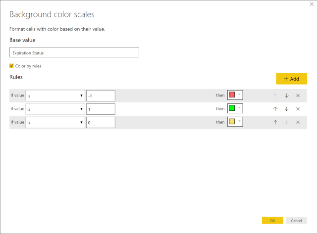
Here’s the table with the conditionally-formatted column:

Why Not Use the KPI Visuals?
The standard KPI visual in Power BI is designed to visualize only one value rather than one for each row in a table. Like an Excel Pivot Table, if KPIs were defined in a Power Pivot or SSAS cube or model; a Power BI Table will simply visualize them but the Power BI model designer doesn’t yet offer the ability to create KPI objects.
Several community developers have tried to fill the feature gap with custom visuals but every one of them seems to address different and specific use cases, such as time-series trending or comparing multiple measure values. I have yet to use one of the available KPI visuals that just simply allows you to visualize the KPI status for each row in a table, without having to customize or shape the data in unique and complicated ways.
How to Design Status KPIs With Indicators
Here’s the fun part: Using the Expiration Status column values (-1, 0 or 1), we can dynamically switch-out the image information in another calculated column. Power BI has no provision for embedding images into a report in a way that they can be used dynamically. You can add an image, like a logo, to a report page and you can reference image files using a URL but you cannot embed them into a table or use conditional expressions.
Using this trick, you can conditionally associate images with each row of a table. This is a technique I learned from Jason Thomas, whose blog link is below. Using a Base64 encoder, I encoded three state KPI indicator images as text which I then copied and pasted into the following calculated column formula DAX script:
Expired = SWITCH([Expiration Status],
1,
“data:image/jpeg;base64,
iVBORw0KGgoAAAANSUhEUgAAADUAAAA1CAYAAADh5qNwAAAACXBIWXMAAB2HAAAdhwGP5fFlAAAAB3RJTUUH4gMcAQsJUd2JhgAAAAd0RVh0QXV0aG9yAKmuzEgAAAAMdEVYdERlc2NyaXB0aW9uABMJISMAAAAKdEVYdENvcHlyaWdodACsD8w6AAAADnRFWHRDcmVhdGlvbiB0aW1lADX3DwkAAAAJdEVYdFNvZnR3YXJlAF1w/zoAAAALdEVYdERpc2NsYWltZXIAt8C0jwAAAAh0RVh0V2FybmluZwDAG+aHAAAAB3RFWHRTb3VyY2UA9f+D6wAAAAh0RVh0Q29tbWVudAD2zJa/AAAABnRFWHRUaXRsZQCo7tInAAAHtklEQVRogd2aS2wUVxaGv1tV7ifQwXQHgrAHxYwmwY5Qdh4xGjIbM9tZDZYGthkkWJoVS1b2MkhMts5IZpc1Xg2LCHZRFBsJKR4hE2nkuHFii35W3XNmUVXd1Xa73X5gW/xSubq7Stb56j917rl1y6iq8p7JOeoA3oXeSyjvoP/h8sYK373+gcXyEj+u/sR6vcLC6lLHOWOlEQqZPJ+VLjFaHOHq0BWGT509sBjMQdxT6423zC3O8/jFfAvg3Mk8xWyKlONwLp/GqiIqWFVWKnUaVlhvWFYrNSAEvXF5gsnRCQrpE0cHtbyxwszzWeYW5xlwXUZOn+LTwZN8XMjjqMWK4IslsBY/+uxbG+7F0hTFGo//VRq8qQu/VBr41jI5OsHU+K09u7dnqOlns3z9/bcoTa4OnePzUoG0Y7BWWjBWhCACSML4YmlawRehYYWmWBpWqAtUZICff6tSDyz3xm9y74+33j3UwuoSd57M8HLtFVcvnGXi4nk8A4EIViyBDUECEQJrCTQECsTiW8GXgGb0uSnhFoPVrVATwXMHWKsK5WrAHwYv8vD6FGOlkXcDNbc4z/2nj0h7lptjlzifz4IqVjVyJQKRROq10i+GsjQl6AklUUSOM8Dr9SYDJsuDa7eZHJ3oK86+q9/c4jx352cYK53m75/8npTjICIoIKoIiqqihBGpKigQ7xSU9vFY8SXtdmlFfIYLHuWqz935GYC+wPqCioG++N1H/OVCCUPojiQARMLqphrDtSHi70mQiDf+pfV3M5wVy+kM5FK5vsF2hIqB/jx0jj+dO40VCQMwisEAIERQoqFr0abxPgZvfdcEvCIKAq2066a002T4dH9gPTuKhdUl7j99xCdnCoyfLYTuiGCtRAUhLApxxbMq4XEVRKUDUNq+oRoCxFsMvTU5t4IV82nuP320ZUDvG+rOkxk8x+f6cAmrUeBRlbNRAYirnY1LuErLMdsC2wQYQcag4W9g+yhZxRz4WuPOk5ndQ00/m+Xl2iv+evFDVG3oQFzhos0mYaLjsVPx7zbqIqS119Y++dnSvkd7yYplqJDi5dorpp/N9g+1vLHC199/y+iZk5xwaUNouMVpF3YJ0irhQeRUPE7FpT7eRAUr3cFs5FY/EvEp5jymn3/D8sZKf1Azz2cJtM6VYj7hjG11B62g4zRMHI/vNRvBxRciBEwCaMdvwS77msGcQ8ZzmXm+1a0tUHFzOlYqYG3QceV9mxxIE21P4nOrm0ikq5W2wyFAuFmlBSS77Naagc+FD3LMLc6z3njbGypuTj/KQKDJICOwpGt2K1B7L/jaTklfhEAVXxLuiOCr4mvvqredHBoMuC5zi/O9oR6/mOf8yQyodKRe3GW3e7hN7tgYONEetRwWglbqxfdd6JYfpeFepCoM5lI8ftEDanljhYXVJUoZNxGMtKcNW7bksSABuclZVQLR6Nz256aEzu1HWU9ZWF3qKBgdUN+9/gGAM1kPX8Kr2NwOysYgAc0u91nTSmt6kdyCqIltquJrP0W8t05lvI7YYVObtFheopjPUmvW8YyDqEEcgzUGF3CMwZiwOTKGVpsUdwmt5rY1mCZTLuFQdLH6GWx3Uq1Z50w+y2K53WF0QP24+hM5z+CLIkZwHYMrBpcQzDHahoLob6IZ7QIlcaVLFIWDAoqVdsPYu0Kt1ysYAw0RPGPwYqcwOMbgRO6ELsVQIVLcYcdTEBuVaRs5FGgI1VTtOs3YjxxjWK9XukMtrC7x6YcnqYvPgInSTg2u2QRFmH5JxfMlicBECUs32i7leyzdO+lE2mXhl23SD8IUCkSxRkO3TJh+jonuKcI9JH0KFTaqRE6FbgWETh3mY+Bt51OihBUKxTUGN4JyIHKq06p4Imgjp+L0O4pn2jtOEhWitgYM2qp6ZvO0PHFfHfXD+Y5xaqw0wtuG3fbksLrR0b8l+zg5IqC3DdvxtKkDqpDJ77qxPA4SVQqZfOt7B9RnpUv0MOrYqmHD2GN1QI0WR3hTqZFNZQ49sL0qm8rwplJjtLhN+l0dugLARj043Mj2oTjWOHbYBDV86ixjpRFqwaaR9RirFhjGSiMdiwlb5lM3Lk+wVm1izPFfjzPGYa3a5MblzmeAWyKfHJ3AtxYhfWjB7VVCurX0k9QWqEL6BJOjE/z8W5WUN3BoAe5WKS9c8um2SNc1x6bGb5F2s6xV5VAC3IvWqkI9sEyNb12/6go1fOosX37+N8rVAMc5fm45zgDlasC98ZtdVxt7rk998e9/8t/1VwwXPKwcj1HZdVyW1wM+LlzkP//4V9dzepa4h9enGDBZytV3Et+eVK7CgMny8PrUtuf0hBorjfDg2m3KlQYNSR14gLtVQ1KUKw0eXLvdc7l0x8FocnSCryamWP61eqRgDUmx/GuVryam9r/oBu0FrrvzMxTzaYo5Du0ecx2XchXKlf6AYI8L2b7WGCqkEPH3FfBO2utC9r5eOSjmPAZzDs3gYOFS3iG+cpDU9LNZpp9/Q8ZzufBBDocGqvsbrI1xENKH/3JIUptf4xnMpch6yqmMR61Z7+t/ZFMZNuoBtcCwVm0e7Ws8SXV74epMPkvaDZ9AnUi7Hee/bVhElYaFN8fthatuem9ejTtuOv4zwT3o/1Bjc+QsSaGpAAAAAElFTkSuQmCC”,
-1,
“data:image/jpeg;base64,
iVBORw0KGgoAAAANSUhEUgAAADIAAAAyCAYAAAAeP4ixAAAACXBIWXMAAB2HAAAdhwGP5fFlAAAAB3RJTUUH4gMcAQornab5IwAAAAd0RVh0QXV0aG9yAKmuzEgAAAAMdEVYdERlc2NyaXB0aW9uABMJISMAAAAKdEVYdENvcHlyaWdodACsD8w6AAAADnRFWHRDcmVhdGlvbiB0aW1lADX3DwkAAAAJdEVYdFNvZnR3YXJlAF1w/zoAAAALdEVYdERpc2NsYWltZXIAt8C0jwAAAAh0RVh0V2FybmluZwDAG+aHAAAAB3RFWHRTb3VyY2UA9f+D6wAAAAh0RVh0Q29tbWVudAD2zJa/AAAABnRFWHRUaXRsZQCo7tInAAAD9ElEQVRogd3aW28bRRTA8f/s2OTmxHYrNYQ0CXEFRCBRCShpKBWVSgvfmQ9QpeID9JkXJJ649KH1zpnDw8zOehPHsb27TtSRRrGjKDs/nzlztVFV5QMo2U03oKnSafsBv7/4Hnn7LwCnr9609pxWI1IgbDd8XudnJ609qzVIgdgYbPPFr2cMD+4B7WFagSTEcIfRs0fYjuX+wwcM9+8C7WAah5SIPqPnj8m6FtSj6tn/6oDBxwOgeUyjkIS402f04gdsx4IX8D7V/c93GdzrAc1iGoOUiAGjl0+xnQwViZCJqsL+8ZDB3Q2gOUwjkAril6dYa0AEvAMRNCLUC0iIzCf3txgMukAzmNqQS4jMgDhUHIiLmKIGXAHb2/2Ifi9rBFMLUsmJlz9iM0By1OUgeQWkIiUm/RT2hob+htbGLA2pjE4/PwkIVyAcOBdeF+8TKHY3EXA+YHpCf70eZilIZZ54/hibKerGZcPdGJVxiMo0kHPgIkY8AHvb9TALQyZn7NGzR2QmIMjH4EIN73PI8/A6djV1RaQEiup9+t91MGaRZXyBWO/3GP30TZgntJgjJHQbL+nTLyMUu1w+RvMcxjk6ziF3MOXxf/5n+eedAeZfaM4NKRFbjJ58XSLUoxGClzIPnKt2rXyM5i5EqUBMRKMuZi5IQuxscnx6gu1aUBKkiEiaMxKkjIo6FyIRMUVuzCqLYK6FJMT2OsffPphAaKyTEfHlJJiSOiJyFxFx6J2zzIuZCUmIrTWOHx6QdSwYAoQI8dOiUkREJhBF7lwfiWUwV0ISYrPLp1/uhpwwkCQ6Uf3FPJEwMomEHMnDz1k5URczFZIQG5ajz4YRYYKDIiBl18Jr6loqEeSkHGZFpo5OTWIuQRJiLePoaBPbycBkJIUxZaNUwSuq5TIdCTVFpEYUFsFUIAnRNRzudQIiM6HxmBJTIJSYI7F7SYyMxLxp6aBpGqYCOT87Yb2jHN5RMlsijCkwVYhW8kRL1ArKRcyl46BcDHnuWVMXfmEMmpJ8sujE6NVmky8Xr/A+Ns/2doApOXJ+doI1cDgQ1jq37xDSK/zxt+WdM9jeDt/99hqYsmg8ffUGiX/83l2Mws2WqxBwxer3NmJmIWDGMv42Ya5DwDX7kduAmQcBc2ysbhIzLwLm3CHeBGYRBCyw1V0lZlEELLhnXwVmGQQscfjQJmZZBCx5HNQGpg4CahzQNYmpi4CaR6ZNYJpAQAOH2HUwTSGgoWuFZTBNIqDBi55FME0joOGrt3kwbSCghcvQWZi2ENDS9fQ0TJsIWPA0ftFSbJv3+8Jfb7PWENAyBKr3HG0hYAXfDirOndpEwAoisqrywXxf639ULCnBYsymnQAAAABJRU5ErkJggg==”,
0,
“data:image/jpeg;base64,
iVBORw0KGgoAAAANSUhEUgAAADcAAAA3CAYAAACo29JGAAAACXBIWXMAAB2HAAAdhwGP5fFlAAAAB3RJTUUH4gMcAQoZVXGoowAAAAd0RVh0QXV0aG9yAKmuzEgAAAAMdEVYdERlc2NyaXB0aW9uABMJISMAAAAKdEVYdENvcHlyaWdodACsD8w6AAAADnRFWHRDcmVhdGlvbiB0aW1lADX3DwkAAAAJdEVYdFNvZnR3YXJlAF1w/zoAAAALdEVYdERpc2NsYWltZXIAt8C0jwAAAAh0RVh0V2FybmluZwDAG+aHAAAAB3RFWHRTb3VyY2UA9f+D6wAAAAh0RVh0Q29tbWVudAD2zJa/AAAABnRFWHRUaXRsZQCo7tInAAAGaklEQVRoge2aO28cRxKAv+qe2aVISzwu+MDZS3MtCTIfkmzgFFjKfMmlFxzg6O5P+BdQf4D+A0zs6MDEqQJnCwsgE1OwAQaGgAMoHE7nwEdCIndnuvuC7nktKZJL7qwhQwUUZrbn0fV1dXdVT6845xy/U1G/tQF1ytjgzPMnmOdPxlUdANG4Kkq76wDom38ZV5Xj8Vy6u4k73Mcd7pPubo6jSgCk7gnF9Q7of/MI/ccmAObfPRp//x5p3qizWmAMnjO7mzjzCt2eQbdncOYVZmej7mqBmuHc4T7pzgbRR/MQNyBuEH00n3fTuqVWuLS7jlxropfaoCdBT6KXFpFrzXyCqVNqg7MvnmKePyFaW8apyZJeI1pbxjx/gn3xtK7qgRrh0p2vUK0WMrsAaqKk15DZBVSrRbrzVV3VAzXBmb0t7Iun6NW7HkiXtQlqAr16z3t3b6sOE4CaQkHv60fItCb69AGIomhDAZxXZ0l3d3C/Gpr/+H7UJgA1eC7d3sAdv0Qv38epCZxM4FTTn6tmRfXHn+COX5Ju1xMaRgrnegeYZ5vom8sw1QLVAN0A1fTdUTf9eaZTM+ibK5hnm7jewShNAUYMZ3Y2cPYYdfueB8sgdCP8bgTAAK0bqNv3cPa4lsA+Mrgsb9T3P4Pme6DiAkhK3pIMOlxrvoe+/7CWwD4yuLS7jkxeRy2t5GBOxTjVqKoO5dIIoDGqs4pMXif57stRmQOMCC4L2PrB5x5MYpzEATKudstcY1y4F4nQD/6MffF0pIF9JHBp9zEy9z4y1waJcBKBikpdMz4VDolwKgKJkPlFZO590u7jUZgEjADO7G1hf/kJ/afPQTRONCjt4XLvnQKm4nBPeEa0994vP40ssF8JzvUOSLc3UEt3kKkbINoHbdEgkYeUCCdxGH+x92pFPRgoZGoatfSxj5UjCA1XgjO7mz5g3/ssZCISXplpFLySgWTjUQ80hMKFTEbff4g7fokZwYr90nB5wL61CnEzgAnIgKICRDQAlF2X8MZwjJvoW2sjCeyXhku766AN6ubKBZ+4eAqrbq2Atlde810Kzh3uY/a20HfuQhzhE2FXHHO1CBacBWfApeFoinuwAEiWUOMgilF37mL2tq4U2C8Fl3z3JXJjGrX4YQGFLR0tYEogCdgkwKVIXm6rGlYL4NCLS8iN6SsF9qHhskAbrawGQ8oGmuJog6dsgtgEcQli+4hLBmADKIOghmh17UqBfWi4tPsY1ZpBWn8AZ0peMMVvmwaw1IO4BGy/pEnpevaOtNo4ziIzM6jWzKW9NxRcHrDX7lSACvUwEjyWe8j0B+D6+XXJQYtGkVKX1mvL+RivDc71Dki76+jFedSErgBJ5gVbeCsHHIQySV4uZc+6YkwWXk2RiQj94QJpd33o0HBhuOzjatSZyz1UjJuSgbZsfN+PN9tHTPa7KM89aJO8YeTE5JMQdeb9x9whA/uF4NzhPubZJlG7Bdr5SSJr6WCcuLKhZY/1wPW92j643snumTWG64cGKnVrl4C2RO2WD+xDhIYLwaXbGyBH6M4sfroOxg8AiQsGnuiKvZIGYFtAii0/l4TGSIoyZ33dcjTU95Zz4bIsXXfmikJncqM4AdNDgmIDkO1VrhcTTA9xg9f7hRdtP4QJL7ozl09qF5FzP+31v/0CXu0Sf7p0ytMxqCZONfKkGBWdzCMp55DFp71q5lKejDLghMG0LfnhXzD1CY2//vNcuDM3H7MAeioYhO7pfIolFichMxGTL2M84ACcKwMWcMVk0j8VDLz3kh+8XeqDh2fCnem53tePkOb/iO+2z3yJ91JcrK4pr9MkLIcqrVLJRHwgH8hczpDkx31cb/rcj7lvHHNZ0hrdXjgbDMIY7IE5AnuEuCPE+nPscekYzo0/z+4T+7ooPwcMILq9cKFd2lM9l+2GqrnoYnDVV1YWofnCtTzksgQ775aG07rgWZL+/B/sf9Mzd2lP9VwRsGeHqtCLy2dTP/UfgX3tj9l57r1e8NTw2xVRZ/bcwH4CLt8N7cxCpIeudOBtVCeO0jLnEkAViTRRZ5Z0Z+ONgf0EXLq9gUzE6HbrapWPQXS7hUzEbwzslVCQ7Zfpdgv76+uxGHhVUbPXvc3LfzsRGioTSv/bL2rfyq1L1AcPTwT22v+H8lvKuz+2va3yDu5tlXdwb6u8g3tb5XcN938F12KOySmWigAAAABJRU5ErkJggg==”
)
The encoded binary strings correspond to these three images, in this order:

To reuse this, you should be able to simply copy and paste this code from here into a new calculated column. You no longer need the image files because that binary content is now stored in the table column. It really doesn’t matter what labels you use for the status key values as long as they correspond to the keys used in the preceding code. I’m using the conventional -1, 0 and 1 because that’s the way SSAS KPIs work.
On the Modeling ribbon, set the Data Category for the new column to “Image URL”:

That’s it! Just add any of these columns to a Table visual and WHAM, KPI indicators!

*Incidentally, since adopting Jason’s technique, Gerhard Brueckl came up with a method utilizing Power Query to manage and import image files that I will use in the future. Prior to that, I used this site Jason recommended in his post. My thought is that if a separate table only stored three rows (one for each KPI status), the status key value would be used to relate the tables. It would be interesting to see if using a related table reduces the PBIX file size or if VertiPaq can effectively compress the repeating values of image column. May be a good topic for a later post.
http://sqljason.com/2018/01/embedding-images-in-power-bi-using-base64.html
https://blog.gbrueckl.at/2018/01/storing-images-powerbi-analysis-services-data-models/
CALL TO ACTION:
Please vote up this feature request so we can get the Power BI product team to add it back to the product:
https://ideas.powerbi.com/forums/265200-power-bi-ideas/suggestions/9378456-when-will-the-kpi-red-yellow-green-indicators-be-a


I’m happy to hear that. Glad it helped you find a solution!
Perfect timing for this as I was researching today for something exactly like this today for a project I am working on! Thanks for the awesome post!