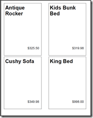
A reader recently asked for some help creating a “4-up” sheet of labels. She referred to one of the recipes on page 383 in our Wrox Press book Microsoft SQL Server Reporting Services Recipes for Designing Expert Reports, about creating mailing labels. The technique in the recipe used the multiple column feature of SSRS. This made me give this a little more thought and I’ve come up with another way to get to the same result, possibly with a better outcome. These techniques could be applied to different “Avery Style” full sheet card and label layouts that have any number of columns and rows.
The columns feature is Reporting Services is not particularly robust and hasn’t seen any improvement since the first product release in 2003. I’ve found it to be a feature that either does what you need it to do or not and we have little control to persuade it otherwise.
There are at least two different techniques we could use to produce 4-up labels and I put together the two attached sample reports to demonstrate them with a very simple dataset. One of these reports uses the multiple columns feature and the second uses a matrix with columns grouped on an expression that should always produce two columns. In the matrix report, I used the MOD (modulus) operator on the dataset RowNumber to segregate even and odd numbered records. The attached PDF file shows the output, which should be nearly identical for both reports.
Keep in mind that the report columns technique is only supported by SSRS output formats that use GDI rendering such as PDF or Image/TIFF. If you preview the report in the designer or in a web browser, you will only see one column. That’s just the way it works. However, if you print the report using the Print button on the report toolbar, I would expect it to print with multiple columns. The other option is to first render to an image or PDF file and then print it, which is not an ideal solution in most cases. To get the columns to wrap correctly, I’ve always had to experiment with the width of the report body, the width of the report page and the margins.
Download samples: Sold Tags reports


Thank you.. its a nice example
Thank you! Why does it only output on odd # pages? Page 2 is blank.
Hmmm, that’s odd 🙂 It’s been a while since I worked through this so I don’t know. If you get this sorted out, please post your solution. Thx
Commonly, a report will produce a blank page when the report body is wider than the print page. Try adjusting the report size.
In the preview window you can click on the ‘Print Layout’ button. Then you get a preview of the report how it will be printed on paper.