Paginated Reports eBook Introduction, Resource and Sample Data Downloads
Whenever we consider visualizing data, we are weighing different types of visualization against each other. Sometimes, it can become hard to find a proper data visualization to communicate the data’s meaning. Finding the appropriate visualization type becomes more manageable if we can provide a name to the challenge the visualization has to tackle: Deviation, Correlation, Ranking, Distribution, Change over time, Part-to-Whole, Magnitude, Spatial, or Flow.
The tabular structure of the table or matrix form reduces the number of visual clues available dramatically. We are used to adding KPI icons or conditional formatting to the data that colors the cells’ background in the tabular structure like a traffic light.
A heatmap is another visualization type that can be used in combination with the precise display of numerical data and can add tremendously to our data understanding and help discover new insights.
A heatmap is a graphical representation of data in two dimensions (rows and columns). Color highlights and emphasizes different factors of the values. Heatmaps allow the reader of the report to understand the dissemination of the data quickly. In contrast to other visual aesthetics like height (used in column charts), the coloring of a cell background maintains the data’s accurate representation – the number.
This recipe guides you through the creation of a heatmap used on top of a matrix.
Recipe Ingredients
- Here you will find hints about the products and versions and the skills needed to build the report.
- The Reporting Services report created with this report has been build using the Power BI Report Builder.
Product Versions
The following product versions are needed to follow this recipe:
- Power BI Report Builder
- Paginated Reports
- Power BI Report Server
- Microsoft SQL Server Reporting Services
Skills you need
- Some experience is needed to execute SQL statements against a SQL DB, either on-premises or cloud-based
- Some experience is needed to create a paginated report (experience creating SSRS reports is sufficient), e.g., creating a data source should not be a miracle.
- Understanding of the scope of aggregation functions
- Ability to read simple Visual Basic code
Difficulty Level: 300
Contributed by Tom Martens
Introduction
Figure 1 shows the result of this recipe. This recipe shows how the custom code feature inside a paginated report or a Reporting Services report helps create a heatmap.

Figure 1. A heatmap that highlights the values inside a Matrix
How to build the report
To keep things simple, you will start with a new, empty report file. You will create a data source and one dataset. Power BI Report Builder is used to take the screenshots; if you are using SQL Server Reporting Services Report Builder, there might be tiny differences.
The data source
Create a data source that points to the PaginatedReportDate sample database. Figure 2 shows the data source dialog.

Figure XX-2. The data source
The dataset
Create a new dataset named heatmap, using the PaginatedReportData data source.
Copy and paste (if you are reading the eBook) or enter the following SQL script for the dataset:
SELECT
d.[Year] AS [Year]
, p.ProductCategory AS ProductCategory
, SUM(f.SalesAmount) AS [SalesAmount]
FROM
dbo.sales AS f
INNER JOIN dbo.product AS p ON
p.ProductKey = f.ProductKey
INNER JOIN dbo.date AS d ON
d.TheDate = f.OrderDate
GROUP BY
d.[Year]
, p.ProductCategory;
Figure 3 shows the Heatmap dataset.

Figure 3. The heatmap dataset
The heatmap dataset is the basis for the heatmap shown in Figure 1.
The matrix visual
We are using a very simple Matrix visual to create the heatmap. For this, we are using the Matrix wizard to add the visual to the report. Figure XX-4 shows the use of the Matrix Wizard.

Figure 4. The Matrix Wizard
Figure 5 shows how the matrix visual will use the fields from the Heatmap dataset.
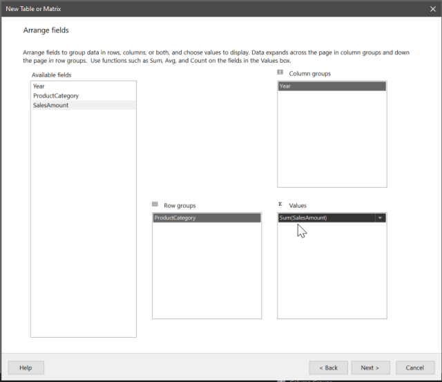
Figure 5. Field arrangement of the Heatmap dataset in the matrix visual
After some formatting, our matrix should look like the one in figure XX-6. 
Figure 6. The 1st matrix
Adding the Heatmap
Unfortunately, creating a heatmap is not as simple as we might wish. From my personal experience, the additional insights that can be derived from our data using a heatmap are worth the effort, and once done, it is easy to use.
The essence of a heatmap is simple: We colorize the cell background of a tabular data structure with different shades of a given color to reflect on the relationship between the cell value and the entire data structure. This endeavor is rooted in something called color theory. Once one starts to pursue this way, she will realize that it’s a world full of wonder and complexities. A starter into this realm is the book by Theresa-Marie Rhyne.
Reading the book, you will realize: color is not linear. But (of course), using linear transformation to determine the different shades of a color is simple, and even more important, sufficient.
On our way to creating a color gradient (another phrase to describe different shades of a given color), it’s sufficient to know that a color can be described using the RGB notation and how this notation relates to the hexadecimal notation.
RGB(255, 255, 255) = #FFFFFF = White
Each pair of characters from the hexadecimal notation represent a single color from the RGB notation. The #-character is considered an identifier. The first pair represents the color value red, and so force.
Note Some programming languages as C# and VB consider the term ToString(“X2”) a formatting string that converts a given numeric value into its hexadecimal representation.
Assuming that we want to transform a given color representing the maximum value in our data to the color white, we can achieve this by scaling the RGB-channels of the given color to the RGB-channels of the color white.
The formulas to scale each color channel separately looks like this:
- ChannelR = x * r(given color) – (x-1) * 255
- ChannelG = x * g(given color) – (x-1) * 255
- ChannelB = x * b(given color) – (x-1) * 255
With x = (CurrentValue – MinValue)/(MaxValue – MinValue)
The above formulas are taken from this thread (but slightly adjusted): How do I calculate color gradients? – Graphic Design Stack Exchange
Creating a single expression inside a paginated report that considers the outlined algorithm from above is not possible. For this reason, we are going to use custom code. The Custom code feature allows using VB6 code inside a Reporting Services report for quite some time. Luckily this code will be executed by the Power BI Service as well. You have to be aware that you will not be able to use each library you are used to when working with SQL Server Reporting Services or Power BI Report Server.
Nevertheless, the custom code (a simple function) that we are using to determine a shade (a color on its way becoming white) from a given color (used for the max value) from a given color using parameters will be executed flawlessly by the Power BI Service.
To add custom code to your report, use the context menu to open your report’s report properties or the sample report “Heatmap.rdl” and select code. Figure 7 shows the corresponding dialog with the function already added.

Figure 7. Report Properties – Custom Code
The code:
Public Shared Function GetStepFromColorGradient(ByVal CurrentValue As Decimal, ByVal MaxValue As Decimal, ByVal MinValue As Decimal, ByVal FromColorHex As String) As String
Dim iColRFrom As Integer
Dim iColGFrom As Integer
Dim iColBFrom As Integer

iColRFrom=Convert.ToInt32(left(right(FromColorHex, 6),2),16)
iColGFrom=Convert.ToInt32(left(right(FromColorHex, 4),2),16)
iColGFrom=Convert.ToInt32(right(FromColorHex, 2),16)

Dim iColR As Integer
Dim iColG As Integer
Dim iColB As Integer
Dim strColorHex As String
Dim x as Decimal

x = CInt(CurrentValue - MinValue) / (MaxValue - MinValue)
iColR = x * iColRFrom - (x - 1) * 255
iColG = x * iColGFrom - (x - 1) * 255
iColB = x * iColGFrom - (x - 1) * 255
strColorHex = "#" & iColR.ToString("X2") & iColG.ToString("X2") & iColB.ToString("X2")

Return strColorHex

End Function
Note You can use multiple functions. Simply add functions in the code section of the report properties. It’s not necessary to separate numerous functions using a special character.Figure 8 shows how the custom function is used inside the Fill expression of the value Textbox.

Figure XX-8. Calling a custom code function inside an expression
The expression:
=
Code.GetStepFromColorGradient(Sum(Fields!SalesAmount.Value), Max(Fields!SalesAmount.Value, "ProductCategory"), Min(Fields!SalesAmount.Value, "ProductCategory"), "#FF9900")
It’s necessary to notice that the aggregation functions Max and Min are providing a 2nd parameter, the expression scope. Using an expression scope allows creating the heatmap either for each row, referencing the row group, for each column by referencing the column group, or even the entire dataset by using the name of the dataset.
Final Thoughts
Using heatmaps is tempting for many reasons, the most compelling reason: they have the power to add beauty to otherwise boring data by choosing one or more appealing colors. Of course, we do not have to limit ourselves to just one given color. Everything is possible using custom code.
Please, withstand!
Try to use heatmaps as the weapon they are to discover unexpected relationships in your data. Use ordered axis (I consider column and row headers as an axis of a tabular data visual) like date, from low-price to high-price articles, etc. Then use coloring either to support your assumptions or try to break your used perspective. I prefer the latter, as I consider the impact on my understanding of the data much higher.
Related References
- How do I calculate color gradients? – Graphic Design Stack Exchange
- Applying Color Theory to Digital Media and Visualization by Theresa-Marie Rhyne